Total Pageviews

Wednesday, 1 November 2017

Studio Art Oil Pastel Blogpost


Concept:

My concept behind this piece was that I go to the library a lot, and in the library, I always stop and admire the beautiful artwork and pottery on display. When I look at them, I always look in an artist's point of view of how I would have made the art and how I would have recreated it, which is why there is a paintbrush held on the side. I wanted to merge my love for art with my frequent trips to the library. 

Successes:

I think I was successful in my subtle color variation and layers on the vase, as well as the reflections and shadows. I also like the highlights on the metallic part of the paint brush and the frame of the table.

Challenges:

I feel it was a challenge filling up my background because I didn't want the railings to seem too crowded. Since the background was more zoomed out, it was a challenge getting the fine details. 

Feedback:

Compliments: 

My peers liked how I controlled the oil pastel to create lighting, reflection, and shadows, and they particularity liked the part where the light bounces off the vase. Furthermore, they liked the detail and color variation on the vase.


Criticism:

My peers suggested that I should have paid more attention to the railings in the background, especially the area on the far right. They said my inspiration for this artwork is conceptually harder to understand just by first look, but when explained is unique. 

My goal for next time:

My goal for next time would be to pay more attention to my background and how to fill in space effectively. 

Tuesday, 10 October 2017

Studio Art Pencil Drawing Reflection


Theme/Story: The theme behind this was food and family gathering, and I also wanted to depict Indian culture. In our family, vacation or holiday means eating food and celebrating our culture. I drew Indian sweets because usually celebrations or holidays are celebrated with something sweet.

Emphasis: Since food is a big part of our definition of "holiday" I wanted to make the food the center of attention. That's why most of the board is covered with the food on the plate. I also wanted to bring in contrast, so with the warm colors of the food and plate, I added a cold color, blue, for the tablecloth. The blue acted as a tablecloth but also as something that looks similar to flowing water, where the lamps are "floating" in.

Line: I had a lot of overlapping objects like the overlapping food and the plate on the tablecloth. For this, I used shadows where I tried to show the 3-dimensionality  of the objects. I feel I could work on strengthening those shadows, but I also think overlapping was a good compositional idea.

Feedback I received: My peers said that my colors were vivid, the food looked glossy and appealing, and there was a good layering of color on the food. They suggested to make my composition more random, not so structured, to make my shadows clearer, and to make the plate more glossy with highlights.

Wednesday, 20 September 2017

Studio Art Charcoal Still Life Reflection


Reflection

          This work of charcoal was very important because it showed our ability to draw reflective objects as well as understand concepts like composition (cropped object), contrast, and use of lines. I think this has appropriately pushed me as an artist to look carefully at a set-up in front of me instead of looking at a reference photo. Since our viewpoints and positions kept changing every day, this project taught me how to critically observe positioning. One very valuable piece of advice I learned from Mr. Laurence was that the white pencil for highlights need to be minimal, as it can easily get overdone and ruin the overall realism. I had worked with charcoal once before (in 8th grade), so that experience had taught me things like dirtying the paper, using highlights, and utilizing my materials appropriately. This experience was very unique though because we had to set the objects up in front of us and directly observe the still-life. 

Successes:

          I think I was successful at the highlights, especially the highlights of apple and glass's reflection. I tried to use the white pencil only when necessary, but the white pencil really helped bring life to the objects. I also think the composition of the overlapping objects helped because not all objects were equidistant and I also got a good variation of shadows. 

Challenges/Things to work on:

          I feel like my shadow of the candlestick could have been further refined. I could have also shown it through the glass. I big challenge in charocal work is smudging, and many times I'd wipe away a lot of my work and have to work back. For me though, my biggest challenge was getting started with a strong idea. I started off with something but wasn't committed to it, and spent about 2 blocks figuring out what I wanted to do. Consequently, I lagged behind and needed extra hours after school to catch up. In the end, though, this experience taught me an important lesson on time-management and the importance of starting off strong. I will use this as a reminder to keep my future projects on schedule. 

Feedback:

          Some feedback I recieved was that I had smooth shading and my reflection highlights weren't too harsh. They said I had strong compostion with different shadows, and my objects showed variation in shape and size. They also said I had a good contrast, with blacks against whites to define the sharp edges. But they also recommended I work on my candlestick's shadow as well as distinguish the apple from its shadow.


MY PROGRESS:

First Day
 

Second Day 

Third Day 

Fourth Day 

Wednesday, 6 September 2017

Studio Art- Egg Composition Pencil Drawing


Concept:

There are two eggs or "beings" of a different race together in the same basket. Above, an eagle's feet are shown. Eagles symbolize power and justice and this eagle is acting as a messenger to delivering the two multiracial eggs justice. The tag with "To: Justice" literally takes the concept of bringing something to justice and is an address for "justice". The blanket provides as a protector during the journey of the delicate eggs in their pursuit of justice. 

Successes:

I am proud of the intricate fabric I made because the fabric had many folds and places where the light fell. I also like the meaning behind my peace, as I feel this artwork is trying to convey a greater message with each element standing for some sort of symbolism. 

Challenges/Things to work on:

My success was my challenge too. The fabric looked cool in the end but required a lot of time and patience. I had to look square by square and perfectly match the complicated placements for shading. I could work on my eagle's feet and perhaps the basket, and for that, I should work on spacing out my time so that each element gets equal attention. 

Feedback:

 I was told that my contrast with the harshness and darkness of the basket with the soft, white blanket was there. I was also told that my fabric was detailed and realistic, as well as the meaning behind this piece was deep and thoughtful. My group also liked the contrast of the white and black egg which, along with the "Justice" tag, hinted at the meaning behind my work, and they liked the movement created by the fabric and rhythm of the contrasting lines. They said I could work on the realism of the eagle's feet as well as making more outlines prominent in my fabric. 

Monday, 14 August 2017

Studio Art Course Goals and Resources

Goals (Personal goal, Course goal):
My course goal would be to make sure I think outside of the box and be more creative with my art. My personal goal would be to not procrastinate so that I can complete my artwork in time.

Principal and elements of art:
Principals of art:
- Line: Line is an element of art defined by a point moving in space.
- Shape: shape implies spatial form and is usually perceived as 2-dimensional.
- Color: colors all come from the three primaries and white and black. They have three properties, hue (the color itself), value, and intensity (the pure color is of the highest intensity, but we can lower the intensity by adding its complementary color).
- Value: value refers to relative lightness and darkness and is perceived in terms of varying levels of contrast.
- Form: form has depth, length, and width and resides in space. It is 3-dimensional.
- Texture: texture refers to the tactile qualities of a surface (actual) or to the visual representation of such surface qualities (implied).
- Space: space refers to the area in which art is organized. The element of positive (the space of the shape itself) and negative space (the space around the shape).

- Perspective: Perspective is representing a volume of space or a 3-dimensional object on a flat surface.
Elements of Art:
- Balance: Balance is the impression of equilibrium in a pictorial or sculptural composition. Balance is often referred to as symmetrical, asymmetrical, or radial.
- Contrast: the juxtaposition of different elements of design (ex. rough and smooth textures, dark and light values) in order to highlight their differences and/or create visual interest, or a focal point.
- Emphasis: Emphasis refers to the created center of interest, the place in an artwork where your eye first lands.
- Movement/Rhythm: movement or rhythm refers to the suggestion of motion through the use of various elements.
- Pattern: Pattern refers to the repetition or reoccurrence of a design element, exact or varied, which establishes a visual beat.
- Unity: Unity is achieved when the components of a work of art are perceived as harmonious, giving the work a sense of completion.

- Proportion/Scale: Proportion is the size relationship of parts to a whole and to one another. Scale refers to relating size to a constant, such as a human body.

Color wheel:
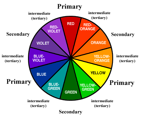
The primary colors are red, yellow, and blue. They are the base for all the other colors on the color wheel.
The secondary colors are in the middle of the primary colors (are made up of primary colors). They are orange, green, and violet.
The tertiary colors are made up of a primary and secondary color. They can also be called intermediate colors. Examples are red-orange, yellow-orange, yellow-green, blue-green, blue-violet, and red-violet.

Complementary colors are colors that are opposite each other on the color wheel (ex. red and green, blue and orange, and purple and yellow.) In a formative practice in 8th grade, we had to take two complementary colors and add a bit of the opposite color to both sides (add a bit of yellow to purple on the right side and add a bit of purple to yellow on the left side) and keep doing so in a line until we reached the middle. The color gray was formed. We concluded that mixing two complementary colors results in gray.
Image result for color wheels
Your definition of art:

My definition of art is something that allows us to express ourselves in a way that can't be put into words. it reflects our personality, mood, traits, and what we hold important in our lives. Art is boundless and even though we usually associate art with painting or drawing, art can be in many other forms such as music, dance, media, drama, etc.

Sunday, 21 May 2017

Health Addiction DECIDE Model


D
Define Addiction Consequences

Identify negative consequences of addictive behaviours you want to avoid. Explain why?

  • Craving for that thing again
  • Depression when I don’t get it
  • Rash behavior, irritable

I want to avoid these things because if I don’t get them, I will feel bad about myself and it will lead to repetitive and excessive behavior


E
Explore Possible Options

List 3 possible choices you could make to limit or prevent your exposure to these consequences.
  1.  discipline (limit the duration/amount) of doing something eg. exercise, eating, internet
  2.  understanding-- if I better understand what is happening to me and the scary consequences, I will be more aware
  3. Adult: sometimes we don’t realise what we are doing and an adult is important to let us know and keep us on track with our goals


C
Consider Possible Outcomes


Provide 2 positive and 2 negative outcomes of the choices listed above.

Positive
  1.  with the 3rd one, there will be more discipline and supervision so  it will be easier to prevent our exposure to addictive things
  1.  with discipline, we will change our bad habits

Negative
  1.  with the 1st one, chances are that when we are addicted we won’t easily stay disciplined or have enough willpower to continue with our goals.
  2. With the 2nd one, that may not be the most effective because a lot of the time we are aware of what we are doing and it’s just the choice we make from a source of motivation that affects everything.


I
Identify your Values


What do you value about your health? About your future? Why is your reputation important to you?

I am aware that addictive behavior leads to dire consequences; in fact, anything done in excess can be bad. My reputation is important to me because my family doesn’t encourage such behavior and they teach me to make the right choices. I am self-motivated to do well and I want my future to be as positive as possible so I can progress and be a role model to my family.


D
Decide and Act in agreement with your Values

Provide an overview of how you could carry out a plan to have healthy lifestyle in high school and college..

Alternatives to risky behavior:

D ifferent ways to deal with stress and entertain yourself -

  • Exercise (not to the point of addiction)
  • Art
  • writing/reading
  • Music
  • Yoga


Ways to say no respectfully and forcefully  –
Start off by saying no, but if things go further, then  I can move myself away and/or reach out to an adult.


How to avoid high pressure situations – stay away from potential danger and don’t think that if some group of people are addicted to something, that it is common and okay.


E
Evaluate Your
Plan

Identify a realistic goal that you would hope to achieve to prepare you for high school/ college pressures.

Stay away from groups who may influence you and be clear about the consequences of addictive behavior.

 How will you know if your plan is successful and that you have protected yourself?

I will know when I am able to let such a surrounding not affect me .