Total Pageviews

Tuesday, 14 August 2018

AP Drawing Blog Post

Goals (Personal goal, Course goal):
My course goal would be to push myself creatively using different art mediums. My personal goal would be to manage my time and be more efficient so that I don't feel stressed out near deadlines.

Principal and elements of art:
Principals of art:
- Line: Line is an element of art defined by a point moving in space.
- Shape: shape implies spatial form and is usually perceived as 2-dimensional.
- Color: colors all come from the three primaries and white and black. They have three properties, hue (the color itself), value, and intensity (the pure color is of the highest intensity, but we can lower the intensity by adding its complementary color).
- Value: value refers to relative lightness and darkness and is perceived in terms of varying levels of contrast.
- Form: form has depth, length, and width and resides in space. It is 3-dimensional.
- Texture: texture refers to the tactile qualities of a surface (actual) or to the visual representation of such surface qualities (implied).
- Space: space refers to the area in which art is organized. The element of positive (the space of the shape itself) and negative space (the space around the shape).

- Perspective: Perspective is representing a volume of space or a 3-dimensional object on a flat surface.
Elements of Art:
- Balance: Balance is the impression of equilibrium in a pictorial or sculptural composition. Balance is often referred to as symmetrical, asymmetrical, or radial.
- Contrast: the juxtaposition of different elements of design (ex. rough and smooth textures, dark and light values) in order to highlight their differences and/or create visual interest, or a focal point.
- Emphasis: Emphasis refers to the created center of interest, the place in an artwork where your eye first lands.
- Movement/Rhythm: movement or rhythm refers to the suggestion of motion through the use of various elements.
- Pattern: Pattern refers to the repetition or reoccurrence of a design element, exact or varied, which establishes a visual beat.
- Unity: Unity is achieved when the components of a work of art are perceived as harmonious, giving the work a sense of completion.

- Proportion/Scale: Proportion is the size relationship of parts to a whole and to one another. Scale refers to relating size to a constant, such as a human body.

Color wheel:
The primary colors are red, yellow, and blue. They are the base for all the other colors on the color wheel.
The secondary colors are in the middle of the primary colors (are made up of primary colors). They are orange, green, and violet.
The tertiary colors are made up of a primary and secondary color. They can also be called intermediate colors. Examples are red-orange, yellow-orange, yellow-green, blue-green, blue-violet, and red-violet.

Complementary colors are colors that are opposite each other on the color wheel (ex. red and green, blue and orange, and purple and yellow.) In a formative practice in 8th grade, we had to take two complementary colors and add a bit of the opposite color to both sides (add a bit of yellow to purple on the right side and add a bit of purple to yellow on the left side) and keep doing so in a line until we reached the middle. The color gray was formed. We concluded that mixing two complementary colors resulted in gray.
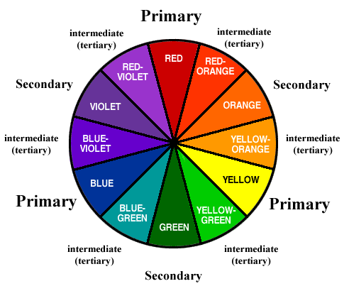
Image result for color wheels
Your definition of art:

My definition of art is that art is a direct reflection of our perception of the world around us. It reflects our personality, mood, traits, and what we hold important in our lives. Art is boundless and even though we usually associate art with painting or drawing, art can be in many other forms such as music, dance, media, drama, etc.

Sunday, 3 June 2018

Ceramics Final Reflection


CERAMICS FINAL REFLECTION

Photo of final glaze piece
Final thought on the best
parts of this piece.
Project 1


The best parts of my
piece were creating a
unique shape of honey-
comb using slab. I also
 like how I manipulated
the amount of glaze to
give a scratched, antique
 look. 
Project 2

I think the best part of
this vase was the carving
 detail I added below the
neck and the pinched
shape of the lip of the
vase.  I think these
additions made the vase
 unique. I also like the
warm autumn color of
the vase and the patches
 of olive green and
fuschia that show
through like strokes. 
Project 3

What I found really
interesting about this
tripod mug was how I
 used the same glaze as
in the vase, but different
 applications and
amounts of the glazes
 dramatically changed
the color. I really love
the jade green and hints
 of blue and pink that
show through with a
golden yellow that
highlights the sharp
edges. I wanted to create
a unique tripod mug, so
I gave a deconstructed
effect by layering rings.
I think this made the
mug more modern, yet
 the glaze gave a
traditional effect. 
Project 4

I really like the sentiment behind the shoe, how it pays homage to
the victims of school
shootings. I wanted to
make a kid's shoe
because it reminds me
of my younger siblings
and how grateful I am to
 be living in a safe
environment. 
Looking at all of your work in class, tell me how you felt about what you accomplished.
I am genuinely very pleasantly surprised by my journey. I didn't think I would ever be able to create
the sophisticated ceramics pieces I see in shops and museums, but now I definitely have more confidence
in working in with clay and slip.  I will definitely continue working with clay, and hopefully, I can come
to ceramics class again and create some more work!

What could I do better as a teacher in making this class better?
I really appreciate the genuine care you have towards us and your passion to help us feel more confident
 in our abilities. Maybe if we can have shorter demos intermittently, like showing steps one and two, and
 then waiting for everyone to reach that stage, then continuing again...that would help us remember
exactly what steps to do and keep us all at the same pace.
Thank you so much for everything, including helping us when we struggle and making ceramics so open
 to anyone of any skill level. Thank you for encouraging our effort and progress, not just the visual
appeal of our work.

I’ve enjoyed this class with each of you.  I wish we had more time together. Have a great summer and
I will miss all of you.
Mr. P


Sunday, 27 May 2018

Ceramics Final Exam- Shoe Reflection


Shoe Sculpture
Insert Construction Photo:
Insert Reference Photo:

Describe all the skills you used to create the sculpture:

This project was an amalgamation of many skills we've used throughout this semester. We
used undulation for the front of the shoe where the toes go. We did imprints using popsicle
sticks cut at different widths and angles and other ceramics tools.
List your areas of difficulties and why:

I found it difficult creating the base shape of the shoe, especially since my shoe was a smaller one.
I also found it hard to carve the clay to give the illusion of layers of fabric. 
Pre Glaze Fire Photo

Post Glaze Fire Photo

Glaze Record/Technique: Teacher's Palette Cotton white glaze for the rubber parts of the shoe.
Blue Stone glaze for "jean" part of the shoe. The application was mostly left to right.

Final Reflection, what was the most rewarding aspect of the project and why?

The most rewarding aspect of the project was the concept behind this final exam. I have twin younger
siblings who have just turned five, and the school shootings have sadly targeted kids from that age group
as well. This project is therefore very close to my heart. I think this shoe is a reminder of the hope we still
have to build off of the hate and create a more peaceful world for children.

Wednesday, 16 May 2018

Ceramics Tripod Reflection


Tripod mug
Insert pre fire photo here:


Construction
What skills, techniques, or process did you employ to create your mug?
I used skills previously done before, like undulation (vase) and slab work. What we did that
 was different from the previous units, though, was making the three "legs" of the vase, which
required new skills like filling the holes in with clay and closing the base of the vase.

How does your final construction look? Also describe the difficulties in construction.
I wanted to do something different with my construction. I think the final construction looks very unique
and cool, and I think the design gave it a more modern "deconstructed" look. It was difficult to slice the clay
evenly, and it was also hard to smooth out the sides since the shape was complex.

Glazing
Insert Pre fired Glaze photo:

Insert your post fire Glaze photo:

Glaze Record and technique:

Chun Plum (55) over textured turquoise. I used 2 coats of both in a left-right brush motion. I was really
really happy by how the turquoise came out more because it gave a really pretty "jade" green look with closer
details of pink and blue when we look closer.

Final thoughts about your mug with a selfie out of your mug in the cafeteria:

Overall, I really love the color that came out, and it really taught me how to manipulate the amounts of glaze
to get variations.

Thursday, 3 May 2018

Studio Art 3D Sculpture Reflection


1. My Concept
I sculpted a chess piece, a rook, for my project. Chess is very close to me as it helps me destress and improve my strategizing skills. The way I view chess is like our path of life, how we decide each move of our life that determines our outcome. I chose the rook piece for its indecisiveness; it moves back and forth. I wanted to capture that characteristic through the freestyle engraving on the rook's body. I chose certain shape elements to illustrate the shape and emotions of our decisions. I wanted the engraving to be free and "confused" to represent the rook's characteristic.

2. Successes
I really enjoyed smoothening out the edges to make the overall shape cylindrical and round and creating the thin crevices between different bumps. I think my concept was executed adequately through the engravings that I added on. This experience allowed me to think deeper beyond tangible objects, and into a more relevant concept. 

3. Challenges
It was challenging for me to reduce the rectangular block into a cylindrical shape. It was also hard to keep the balance by sanding evenly and keeping symmetry (sculpting a straight rook). 

4. Peer Feedback
Very balanced, very good detail and thought put into the carving to represent the indecisiveness of rook, holes are subtle, don't take away from the piece. Maybe sand the top a little better to make the surface even. 

Monday, 23 April 2018

Studio Art Watercolor Reflection

Creme Brulee with Fruit
Successes: I think I was successful in controlling the color variation in my piece, especially with the color detail of the creme brulee surface, and giving the white objects (ramekin, plate) some shadows and color.

Challenges: It was challenging controlling the water when working with watercolor, and it was hard to get deeper colors without over concentration. Something that helped this challenge was using watercolor pencil to control the color and then add a layer of water to secure it.

Peer Feedback: My peers said they liked the depth of the creme brulee and the detail of the slightly lighter color variation with the melting crystals of sugar on top. They also liked the contrast of the background's darkness and the light focus. They suggested I use masking fluid to mask out the whites so that it would be easier working around it.

Overall Journey: Watercolor, in general, was a new experience for me, and I learned a lot about the medium along the way, like how water pulls and pushes the paint, dilution versus concentration, and layering the colors for dimension. What I found intriguing was how watercolor was quite different from acrylic; it was hard to get strong colors, but it was easy to get shade variation of a color by just controlling the amount of color added. It was also useful to get a sheet of paper with various watercolor techniques to expand my use of watercolor.

Sunday, 8 April 2018

Ceramics Coil Vessel Blog Post


Coil Vessel
Insert post construction photo:

Describe what you liked about the coiling process of building: I loved how we could control the appearance and shape
of the clay with every step by following the template. I loved manipulating the shape of the coil to follow the undulation.


Describe your frustrations: It was a bit challenging forming the little bump before the neck, and

Did your original idea change? If yes what changes occurred? My original idea stayed the same, but I did decide to add the
engravings a little later in the process because I wanted to add something more unique to my vase.

How could you have constructed better? I should have made sure that I didn't apply as much pressure on areas that are prone
to crack, clean my vase better (smoothening the insides), and revive all over my vase to prevent drying and cracking.

Screenshot of your glaze of choice.

Insert Pre Fired Glaze Photo

Insert Post Fired Glaze Photo

Glaze Record:

Textured Turquoise base (x2)
Chun Plum top (x1)
Glaze application:

I applied two coats of textured
turquoise and then one
thick coat of Chun plum.
I used a left to right stroke.
Describe your final result.  Was it what you expected? (better or worse)

I think my final result was better than I expected. I think I successfully highlighted the engravings because the color
concentrated in the curves and stretched on the edges. I was going for a "warm blue" with all different kinds of colors,
and this result was surprisingly a very autumny warm combination with hints of olive green which I really like.

How could you you have glazed better?
I think I should have put more coats of glaze because I could see my strokes in some places. I think in the future I will also
experiment with the drip effect and use that on the outside or inside.

How could the teacher have taught the unit better?
I really think Mr. P was perfect in his in-depth demos but I'll try :) Maybe if we had gotten more demos on how to do
additional things with our vase (sculptures, engravings, holes, drawing with glaze...) that would have been helpful as well.